Monday, August 25, 2008

What a Success!

The exhibit held at CompassPoint, Undocumented: Latino Immigrant Portraits by Rebeca Garcia-Gonzalez, was a fantastic event. The VIP reception was earlier, to give the press a chance to see it before the rest of the public. Given the tremendous number of people who came (more than a hundred), this was a wise decision. Luckily for us, some came earlier and others late. Martina Ayala and her husband Alex Balmaceda, my friends from graduate school who did all of the public relations, are responsible for such wonderful numbers.

It feels wonderful to have received such support from friends, colleagues, family and total strangers interested in art. They asked very interesting questions. My only regret was to not have had enough time to go beyond, "Hi, thank you so much for coming!" due to the opening's popularity.

The Mission Vocational School's Culinary Department did the catering. I didn't eat, but I heard the food was excellent. They were very professional. We served wine, water and get this: vitamin water. This was another good decision, as the temperature went up with the number of attendees.
Curator Linette Morales spoke first. She talked about the impression the paintings had made on her personally. I thanked the incredible team that made it possible: my partner Sarah Calderon, in charge of the logistics for that day, the framing of all 16 paintings, and of helping me pack and deliver them across the bridge; Carmen Melendez, who did almost all of the graphic design out of her business Pitipua Graphix; Linette Morales, who volunteered her curatorial skills; and Vicky Lee, who supported us on CompassPoint's behalf. Bianca Serra, from The Centro Legal de la Raza, explained what they do to help undocumented Latino inmigrants, since this is the organization that will receive 30-40% of any sales.

I placed a "vote for your favorite" board on a column, and will use this feedback to decide which paintings should I reproduce as gliclee prints. We also asked those those are interested to give us their e-mail so that we can notify them as they become available. There was, however, considerable interest in the paintings themselves. We are working on a way to sell with an agreement to allow other exhibits even as new owners take possesion. We'd like this exhibit to travel to Los Angeles next, but I'd have to find a way to finance the shipping as it is a costly proposition, even if I deliver them myself.


Sunday, August 03, 2008

Designs for the Show


My friend and former classmate Martina Ayala, who is promoting my upcoming show Undocumented: Latino Immigrant Portraits, preferred the boxed version of this postcard, now making the rounds among friends and colleagues. Carmen Melendez, the graphic designer who created this card, also liked the card because of the model, whom she found exceedingly handsome. They also said the green lettered version had a painting with a stronger, more intense stare. This painting made the posterfor the show, but the postcard's final version went to another painting I made much later, a closeup of a young man who perhaps wasn't as handsome, but who also had a very intense look. The colors in both are very bright, but perhaps I'm partial to work done on wood panels. Who knows? I like both. Which one do you like?

Wednesday, July 02, 2008

Undocumented Series


She was the last model to pose who could have made it into the exhibit, and the only canvas I had left measured about 20 x 24." She was also the most forthcoming of all the people I have painted, in that she felt completely free to comment on my style and approach to her portrait (for example, she thought my colors were too bright). I explained to her that I had grown up in the caribbean, where colors are bright, and that this had probably affected my color perception. I also said I didn't think anything looked alive enough if done in a muted palette. So now you have an idea of our conversation. A completely self-possessed young person, she asked many, many questions about my training, interests and background.

Tuesday, June 24, 2008

Undocumented Progress

It's a team effort! My childhood friend Carmen Melendez is designing the bilingual postcard that will announce my August solo show at Compass Point, a non-profit organization on the second floor of a building (731 Market St) in downtown San Francisco. The opening will be on August 22, at 6 PM. The show is titled Undocumented: Latino Immigrant Portraits by Rebeca Garcia-Gonzalez.

Meanwhile, my partner Sarah is framing all fifteen paintings in my studio, no small feat if you consider we do not own professional framing equipment. Doing this is preferable to sending them to a shop, as a framing shop, even a discount one, charges four to five times as much. So we bit the bullet and got an early start.

Linette Morales will be the curator for this show. She will come to my studio mid-July to help me select the paintings that will make Compass Point's small space. My graduate school friend Martina Ayala, a producer and community activist, will promote the show in San Francisco and Los Angeles.

I have been working on both the series statement, and on a reflective essay based on the series's effect. The series statement will be available at the opening, but I am not yet sure of where I would post the essay other than my web site. I did read it to an audience gathered at the writing retreat I was recently coordinating and got some suggestions. However, I do need to start writing the press release.

Monday, June 23, 2008

Santa Fe Week

I've returned from Santa Fe, where I was coordinating a professional writing retreat for the National Writing Project. My colleague Lisa and I decided to take a stroll through Canyon Road before dinner at Geronimo, and got a glimpse of the art business as it is conducted at this point in the town's timeline. I must say we began our walk at 4:00 PM, toward the end of the business day for most galleries there, and as a consequence did not elicit much interest from most of the owners/attendants. There were three exceptions, all on the south side of the famed street. Its gallery attendants left what they were doing to greet us. Soon we saw they were not there to sell pieces, but to talk about art: Martha Keats, Selby Fleetwood and most notably, Darnell Fine Art. All were women, and all were very friendly, despite the fact that we were clearly tourists without loads of money. This was something I did not at all expect after visiting galleries in New York this last November. Their behavior was highly consistent with what the Art Dealers Association of America, in their collector's guide, says should be their primary mission: to educate the public.

We were very pleased with those interactions, but it was very hot and past 5:00 pm. After this time, all the galleries were closed, and so we looked across the street and saw Ed Larson's sign: "Jesus said buy folk art," so of course we found ourselves at The Stables, which turned out to be a collection of seventeen working artist studios. Ed's studio was closed and so were most of the others, but then we glimpsed an open door amid a few heavily impastoed canvasses hung on the outside walls. One of them was a giant rose. The paintings intrigued me, because they weren't folk art, they were not art school art, or self-taught art. They were a hybrid of all of the above. Nobody responded when we called, so I peeked in and saw... a grand piano, in a room just like I had seen in a book I have about Santa Fe artist studios.

David Vigil stepped out of the adjoining bathroom just before we were getting ready to walk into his studio. He had a Kool-aid orange mane, brown skin and abundant chest hair: The Lion King. Fortunately we did not hear a roar but a laugh (I can be charming when I need to), as we hurriedly explained we were curious. After a brief interview in which our provenance was examined, he engaged us in a conversation on the nature of his recent work as artist, writer and composer. I found him quite endearing, not jaded or cynical, in the way he addressed these two women tourists after so many years of selling art out of a studio. We talked quite a bit about creativity. After his young musician collaborator Victor arrived, he mentioned some video clips of his music on You Tube and said he was a happy person. Warning: do not click if you don't like jazz.

We crossed the street again and sat down at the bar inside Geronimo to ponder our encounters. Fiercely air conditioned, this restaurant had a very nice wine list, but that would be another blog entry.

Monday, April 28, 2008

My Learning Process Part II

As I was explaining in a previous blog, when I decided to engage in art full-time after 25 years of doing it "on the side," I confronted many challenges. Some were about my own insecurities, and other were more technical. As I have not yet resolved my own fears about "coming out" with my art, I will focus on the technical challenges in the hope that my experience may be useful to a reader.

One of the first strategies I used was to search for a "friendly medium." I was aware of my difficulties with charcoal, pastels, conte crayons, and anything else involving rubbing or erasing. I sought a medium with whom I was more familiar in an effort to even the playing field, as drawing the figure or a landscape with a time limit was overwhelming enough. I gravitated towards water media because it enabled me to cover large surfaces quickly. I knew how to mix paint and water to achieve the desired values. This is not to say I discarded dry media. I used charcoal for 1 minute gestures.

I also limited myself to value studies for a while, in watercolor and acrylic. In an effort to keep things simple, I did not use any color, just black and white paint, or ink and water. As I felt I was starting to achieve enough contrast and good midtones, I gradually I introduced ochre, red, and eventually blue. I still paint the figure with a primary palette. It is true you end up having to mix all the colors that you want, but it is a good way to quickly reach the values you want without a lot of fuss, and there can be quite a range of expression with just those three colors and white.

Larger paper sizes gave me enough room to work on the nuances in value of the bone and muscle structures I was translating onto two dimensions. This is specially true of the value studies, which required more space. Smaller sizes limited the amount of detail I could render, and thus made it easier to work in color. For example, I use smaller canvases when painting landscapes in oil and acrylic. I have come to believe that the more difficult or the less time you have to complete a piece, the smaller your paper or canvas has to be.

Sunday, April 27, 2008

Rites of Spring


We have continued going out to paint on Mondays. This is despite the poison oak, class-cutting teenagers, and exceedingly friendly dogs (one, named Coltrane, gave me a bear hug). Our group now has three steady people and might continue growing. We tend to meet at trailheads or parking lots, and not stray too far into the park. We actually climb up sometimes steep hills looking for views or just some cool air. It's fun, even if we sometimes have to pass our equipment to each other while we negotiate narrow, slippery cow paths.


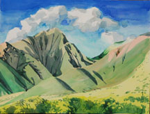
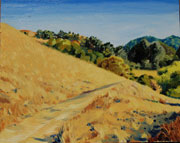
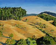
These have all been completed on location, with minor corrections done later in the studio. There are two oils and two watercolors. Can you tell which is which? I find that my oil painting influences my watercolor painting, and that my watercolors influence my oils. Watercolor definitely helps me do very defined, quick but finished work when I feel like it, (see the purple field of vetch behind my standing colleague). Oil is fantastic for its luminosity, and you certainly don't feel like anything is "set in stone."


With these paintings, I feel like I am taking advantage of all the green I can get before the summer heat turns everything gold. Green in our Bay Area just doesn't seem to last as long. As Emily Carr so eloquently put it, "As the woods are the same, the trees standing in their places, the rocks and the earth... they are always different too, as lights and shadows and seasons and moods pass through them."

Tuesday, April 08, 2008

My Website Has Been Updated

I've added paintings and watercolors I've done in the last couple of years, since I've been making the rounds trying to find a venue for a solo show and curators need to see my recent work. This oil was done last summer, but I had a hard time photographing it because of its unusual size (24 x 48"). It is our driveway in San Pablo, with my beloved Toyota Tacoma.

My Learning Process

These past two years I have been participating in more events with other painters and visual artists than ever. I regularly meet with other people to draw or paint. I have also observed people in a class context. At my age and later, many folks who've held a lifelong fascination with art decide to take the plunge. It is because of my interest in how different the process is for every person that I've decided to write about my own learning process.

My background in education keeps me eternally interested in how people learn. I keep several visual and written journals because I like to see if there is an evolution in my painting, because I want to keep track of ideas, and because I like to record what I think about other people's art. I see my own learning process as "strategic, " that is, as the search for approaches compatible with my values and ideas as a painter. Notice I didn't say that I see my art as strategic. It works for me to notice the approaches I use and why. Here's an example:

When I started to engage in figure drawing weekly about two years ago, I was very unsatisfied with my drawings. I had a clear idea of what they should look and I was not even getting close to what I wanted. I was so carried away with the excitement of having a live model that I would end up with distortions and missing body parts (the time limit is short). I could say that at this time, drawing the figure was exciting to the point of being overwhelming. After all, it had been exactly 25 years since I had drawn the figure with any kind of limit. Those who study standardized test performance will tell you that time limits will bring on anxiety and a decrease in the accuracy and quality of the response.

During those first weeks, my challenges were many. I had to draw a complete gesture in one or two minutes. I was expected to draw a credible figure with muscles in 5 to 20 minutes. The drawings had to resemble the model and convey the space and weight taken by the model's body and pose. During the next few days I will write about the strategies I used to assist my learning. Again, by strategies I mean the approach used to surmount a problem, more than a specific technique or material.

Thursday, March 13, 2008

20 Minute Oil Figure Studies


Let's say you are painting without first making a few thumbnails (to plan your composition) and without making a preliminary drawing in black and white (to understand the values). Let's say you gave nominal thought to your palette. You probably grabbed the colors you always use. To complicate matters, your time is very limited, about as much time as a professional model can hold the pose (20 minutes) without needing a break. If you put all of these conditions together, you've got yourself a study.
Artists engage in this practice for various reasons. Since materials have always been expensive, the most commom use has been to "try out" how various combinations of the above elements will work out together in a larger painting. A study can be used because its faster, looser style can capture the subject's character or the atmosphere of a place. You can use it to train yourself to catch the essential elements of what you're painting during the first few minutes.

This last purpose is why I put myself through the pain of sketching with oil in this brief period. It can be frustrating, because the medium was not created for this purpose. Try layering oil paint that has not dried. Try wiping off mistakes you've made in a strong color. Try finishing in 20 min. using a format larger than 11 x 14. Impossible! But so many decisions are made during the first 20 minutes of a painting, that it is worthwhile to learn to make them efficiently and successfully.

Monday, March 10, 2008

It's Been A Month

But I've been busy! Karen and I continue to go plein air painting every Tuesday morning. I am still figure drawing on Wednesday nights at the Richmond Art Center. And I have three paintings at the Prescott Joseph Center until March 31. The exhibit, titled Women Band Together, is in honor of the International Women's Day.

I've actually been busy recovering from (new official name) cubital tunnel syndrome. So I've had to take it easy with the computer. I've been transferring my inventory to GYST, and so far, so good. I like the layout and how everything is well-thought out and interconnected. I've also been measuring and re-measuring my paintings, photographing them, and choosing the ones from which we will eventually make prints to sell. You can help me with that. Just go to my web site, then e-mail me (or Sarah) and tell me which ones are your favorites.

Here's a little oil painting (12 x 16) I started while I had a horrible headache, but I finished it when I was feeling better a week later. As they say, "All's well that ends well."

Thursday, February 07, 2008

GYST Software

In my never-ending quest for professional improvement, I've decided to give this "artist-run company for artists" a chance. I've bought their software for $149., a filemaker database customized to the needs of professional artists. There weren't reviews on the web to help me pick this one from among four or five other contenders, so I had to choose based on minimal descriptions of the features on each website. Some companies had great screen shots to give you a sense of the interface, others, none. GYST had the most comprehensive and informative display on its web site, and what they offer seems to be geared at my needs for the moment, which are to set up and organize my art business. So stay tuned for an account of my trials and tribulations transferring my art inventory and mailing list to the program, as these are the first two tasks I will attempt.

Saturday, February 02, 2008

Immigrant Portraits

I have been painting Latino immigrants for a few months now. Sometimes they bring each other, or I hire them from the neighborhood. They pick their clothes and the pose. I pay them by the hour. At the end of the day I take a photograph print it, sign it, and give it to them. They sign a release and take a copy home. Once they leave, I might finish the background, but I don't tend to work on their image much more. Each painting takes 1-2 sittings, and a total of 5-10 hrs.

I do it in part because they are underrepresented in formal portraiture. I have always done portraits of people of color in oil. But until I saw the portraits of African Americans that Beverly McIver was showing at a show in Sacramento, I did not understand what exactly was it that I was looking for. I wanted to give the sitters exactly the same choices someone with more means might have had had they commissioned a portrait from me, but I also wanted to have more emotional involvement in those portraits. I also wanted to give them the experience of sitting for a portrait in which they would not be treated as the exotic other.

This oil is the latest of seven I have completed so far, measuring 24 x 36". The 12 x 16" charcoal drawing was done as part of a figure drawing session, and not as a study for the painting.

Monday, January 28, 2008

No Cameras Were Harmed In the Making of This Piece

Rather than employing it as a supplement to active, conscious seeing, they used the medium as a substitute, paying less attention to the world than they had done previously, taking it on faith that photography automatically assured them possession of it.
Alain de Botton

I had spent three days last winter, making sure the same morning light passed through our deck door (the setup was on the floor), in order to paint them. This watercolor went to a group show with very strict size limits. Zillions of other pieces, not bigger than 90" in perimeter shared space with these pomegranates. However, at the show many assumed I had used a reference photo. Maybe I need to start placing a comment with the title and dimensions, "no cameras were harmed in the making of this piece."

There is a time and a place for reference pictures in everyone's oeuvre. In my case, I don't use them when the subject is accessible enough, stable enough, to withstand a couple of days of scrutiny. Too much is missed. Color in all its glory, and the "air around it," to use someone else's phrase.

On the other hand, give some of us a palette and a bit of time and the lure of all that detail and sensory overload will lead to seductive tangents. The inclusion of detail where none should have existed may become a detriment for the overall impression the painting makes. The choice is ours.

Monday, January 21, 2008

Two Looks At Inspiration


Inspiration Point is a rather beautiful (and conveniently located) part of Tilden Park. A friend from figure drawing class and I went at 9:00 AM on a blustery morning, and climbed up a steep little hill next to the main and paved path. I was going to take my oils, but it was just too cold to sit there for hours. I took watercolors instead, and a Lanaquarelle pad that is 16 x 20." As it turns out, the sun played hide and seek for a while and this helped me fight the wind chill (I was wearing neophrene gloves and many layers). I don't know why I don't remember that folding chairs don't work on hills (Karen my friend was sitting comfortably on the ground). An easel is what I should have taken, as the wind kept destabilizing my pad.
The sunnier view is of Mount Diablo, and the darker one is of Tilden looking south. The straight line near the top is the actual Inspiration Point parking lot. It looks like we did a lot of walking, but we did not!

Tuesday, January 15, 2008

Painting Altars

I intended this painting as an homage to my uncle, who passed away recently. A middle school teacher, my dad's brother was a beloved figure of my childhood. I was the eldest grandchild, and benefitted early from our conversations. He had the ability to listen to children as if their opinion mattered, and made his contributions in ways that could be understandable to a child. All of his life he wanted to play the guitar, and took up intermittent studies whenever time allowed. I never saw him get upset at anyone, in fact, he has a very positive disposition that made others seek his company. That's how I remember him.

This is one of the windowsills in my studio, and the seven objects are placed on top of the only bookcase. The unopened bottle of rose we bought at Domaine Chandon, in Napa. I took the grapefruits and pomegranate from our fruit basket, and the candle was given to me by a colleague when I worked at Sacramento State University. The black curtains were sewn by my mom because sometimes the blue window light interferes with paintings I have started indoors. I finished it two weeks ago.

Sunday, January 13, 2008

Winter Still Lives

Last year I started a tradition of painting a few still lives indoors, between December and March. Our winter is very rainy, and here on the hills between El Sobrante and El Cerrito, it gets foggy too. All of which makes working outdoors unpredictable. So I turn the focus inward and work from my imagination, from dreams, or from something I can place indoors.

I seldom have the patience to find a decent composition, a skill I need to work on. But something I've realized is that it takes me an average of two hours to paint each object in a still life. This oil is 24 x 36," a manageable size. Still lives beyond these dimentions pose other challenges and as a result take more time.

Instead of cotton duck, the support is engineered birch. I am enjoying painting on this surface, but had to switch to sable brushes so that I would not end scraping 30% of the paint surface with each stroke of the hog bristles.

Friday, January 11, 2008

The Background


Sometimes I am more interested in what's happening behind the scenes than in the foreground. I think it has to do with the need to feel some kind of release after my attention has been focused on rendering accurate depictions of a model or object. I did a series of ink drawings in our figure drawing lab (this is the best one) showing what I can see beyond the model, and they were fun.

Wednesday, January 09, 2008

Safer Oil Painting


Turpentine is banned from most collective painting spaces and classes, even with good ventilation. Turns out that they cause headaches, exacerbate respiratory issues in most people, and if rubbed onto your skin while cleaning brushes, you can end up with contact dermatitis. We don't even know what long-term exposure to it may cause.
Oil paints, while fume-free, should be treated as hazardous chemicals. No one wants to absorb cadmium, titanium or lead through their skin while cleaning brushes, or breathe its dust (if making your own pigments).

All of this has led me to adopt safer ways to paint with oil. I have an exhaust fan in my studio, but I seldom use anymore because I clean my brushes with linseed oil (surprisingly, it takes about the same time it takes with turps). An added advantage has been the cutdown on ferrule corrosion. I save the used linseed oil in cans and dispose of it as hazardous waste. I wear latex gloves throughout the entire process, until I wash the oil off the brushes with soap.

If I want diluted pigment, I use stand oil. In fact, I've been experimenting with a very oily and color saturated first layer. Subsequent layers are less fat and influenced by the fast-drying stand oil on that underpainting. I can usually paint over this first layer the following day. Here is a painting I did over two days in this manner. As with most of my models, this was all the time I had, about six hours.
David Rourke has excellent advice and many more ideas on safer oil painting techniques.

Sunday, January 06, 2008

More Figures


These are more figure studies from last year. A group of us, six to be exact, is meeting at each other's studios while the Richmond Art Center is renovated. Our lab will start again February 6. These are watercolors, but in a much smaller format, about 16 x 20". I've reduced my palette to three colors: Burnt sienna, cerulean blue and yellow ochre. I've been making a line drawing first with walnut ink and a bamboo pen. These are 20 minute scketches.

At Last


HP "fixed" my laptop, or so they say. The truth is, I am tired of sending it out for repair (yes, I fell for their extended warranties). I keep getting it back in the same state, minus my software, which I have to re-install. The screen went black sometime in November, almost two years after I bought it. So, for more than three months I've had to do without it while HP pretends to restore its original brightness. I can see the screen now, but the light is still dim, and the brightness controls have been disabled.
Oh well, enough complaining. I just felt I had to explain why had I not posted in such a long time. I can post from anywhere really, but my laptop is the one with Photoshop. Here's a couple of life drawings I did around that same time (November 07). I have been rotating between watercolor, ink, acrylic and charcoal, and I am now using a relatively small format, although it does take me the same time to complete a drawing.

Thursday, November 01, 2007

Figure Drawing Notebook


Pardon the quality of my images. To make a long story short, my laptop quit and my scanner broke down last month. I've had to edit images on a primitive image editor. We've been doing some short poses, and I've been stitching media to keep it all fresh. The color piece is acrylic, and the black and white piece was done in ink and grey watercolor. These are also smaller than what I've been doing previously, they are from a notebook I've been taking to my figure drawing sessions.

Monday, September 24, 2007

At The Richmond Art Center


I took my partner and parents to an exhibit at the Richmond Art Center, where one of my paintings was featured in the members' only show. I had made this portrait of my mother about two years ago during the winter. She had posed for about eight or nine two hour sessions. The members' show is staged in one of the center's hallways, so we saw the other exhibits first before we got to my mom's portrait. There was the Neighborhood Public Art show in collaboration with the city of Richmond, a photography retrospective celebrating the California College of Arts Centennial, a member's showcase room featuring five artists chosen from last year's members only show, and finally the member's only show. The event was very well attended and diverse, in fact, we could barely squeeze in through the crowd!

Wednesday, September 19, 2007

With No Preconceived Notions


I have been working with the expression of energy through line and brushstroke on canvas, board, and paper. This is the opposite of what I do with my other work, where content, color, and form take precedence over movement. When you are working towards creating the illusion of distance, texture or an environment, it is an extra challenge to convey the stored energy of the brushstroke. I picture the work of expressionists Robert Motherwell and Emily Carr when I think of the preservation of this energy, whether the work is abstract or representational. In these pieces, I abandon the narrative of representation and embark on the joy of movement for its own sake.

Saturday, September 15, 2007

Painting Flowers

Here is a painting done in two afternoons. My neighbor brought these hydrangeas she had picked that same day. In Spanish, they are called hortensias. They were sitting in front of one of my studio windows. I was fascinated that they had not wilted or fallen apart the day after, so I painted them. Here I must explain that two years before I had had a conversation with a florist who told me she would "never do a wedding where hydrangeas where involved," because of their fragility. I wanted to drive over to her flower shop and tell her these hydrangeas had lasted a whole week.

I confess I am not a fan of painting flower arrangements. There is something about the subject that will make viewers smirk inside. Some people have told me I can paint flowers "so well" because I'm female. Ugh!

Should I then move on to disturbing, undecypherable subjects? "Only if you want to sell to collectors," advised a colleague, the assumption being that regular folks (those who don't care whether their art is "serious" or not) like the soothing, the familiar, the kitschy, or beauty for beauty's sake and nothing else mixed in with their art.

Tuesday, September 11, 2007

On Matters of Size

How do artists decide on the size of a piece? This is, assuming this decision is up to the artist, of course. Sometimes, it is not. I recall a call for entries from the California Watercolor Association. Only pieces about the size of a coffee table were considered. This effectively ruled out most field work, as it is extremely difficult to work on paper of that size outside of a studio. This in turn meant that most of what I had done could not be sent.

So if artists can choose size, how do they go about this? I can only talk about my own experience. Some of these choices are arbitrary and have to do with what's available at the moment, and how badly you want to hop in your car and drive to the art store. Some days, I'll just grab an odd-sized canvas or piece of paper because it's been lying around too long, then I'll challenge myself to find a composition that fits it.

More deliberate decisions usually have to do with time. A small representational piece almost always takes less time to complete than something double its size. This cabbage painting, for example, is 12 x 12 inches. It took me three two-hour sessions to paint it in acrylic, while a larger canvas would have taken me six or seven sessions. Had I decided to do it in oil, we would have had to add additional time, as some effects may have required the preliminary layers to dry a bit before I could continue.

Although some of us might like to think that the subject can dictate the final proportions, this belief has been challenged by scholars such as Anthea Callen. A chapter in her book on the impressionists explores the origins of old European standard sizes for marines, landscapes and portraits dating back to seventeeth century France. Callen found that loom size, the convenience of the merchants selling pre-assembled stretchers, and the artists' own priorities influenced size decisions more than the type of subject to be painted.

Sometimes I think of a piece's "presence" as I am considering the size I will assign to it. The same cabbage painting, in a larger size, would have been overwhelming. There is too much contrast and not enough subtlety for a larger size. Or what I paint may become too complicated for anything beyond a foot wide or long. There are days when I want to saturate the colors, and a small piece tolerates this effect a lot better than larger canvases, which would project a certain vulgarity.

Finally, there is practicality. I think of ease of transport and the expense of presentation. Almost all work done in the field is of reasonable dimensions (less than 24" long), given the challenges of that environment. Some colleagues paint in sizes they can store easily, while others choose works commanding awe in the gallery circuit, but expensive to move around. Large pieces are also more expensive to frame and in some ways more fragile.

No matter what the considerations are, size decisions are seldom made randomly, they follow artist's idiosyncrasies and practical matters much more more than any "rules."

Tuesday, September 04, 2007

For Art's Sake

It was during my middle school years when I realized the art world was not the homogeneous, equal opportunity institution I took it to be. Back in the early seventies, I bought my art supplies at a mom and pop framing and art store in Hato Rey, Puerto Rico. The display shelves in the beyond-cluttered one-room storefront were taller than me. More art materials than I had ever imagined advertised their mysterious uses in a secret language I could not yet understand. I needed time to figure it all out. I wanted to examine all of the point-of-sale displays, I wanted to read all the labels, and I wanted to ask how artists used each and every object in front of me.

Upon arrival, I was always greeted by a stentoreous "Are you looking for something?" After my first time, by the tone of their voices I quickly learned I was not supposed to "loiter," that I had to bring a list of supplies for the ancient man and woman behind the counter to fill. That was the purpose of an art store, I concluded. Being that my needs and budget at the time were modest, I used to spread them out over the school semester so I could earn more opportunities to visit. I would go there just to buy one tube of Grumbacher Academy watercolor, or an eraser.

It was during one of those flash visits that the door opened and in walked a teenager not much older than me. Instead of waiting for the standard question, he greeted the ancient woman by name and spent a few minutes on chit chat. She asked him how school was going and I learned he attended an art school in San Juan for those who already had selected it as a career. Before I could process this, he left the counter and selected a few supplies for what seemed like an eternity, nothing expensive. He was never interrupted. Then he went back to the counter and asked for Damar glaze, paid for it all and left.

As soon as he was gone, I was asked again what I needed. I did not have loitering privileges because I was not going to the best art school in the island. Attending a school of the arts didn't count because its graduates didn't go on to earn BFAs. In fact, ancient mom and pop had never asked me where I went to school, the assumption being that art would not become a career for a girl in middle school. All of this didn't sink in until I reflected in the discomfort of those years a bit later and decided that, just like the rest of society, the art world is stratified. Whether we like it or not, public perception will place us in one category or another. The art store was one of my first lessons.

Tuesday, August 28, 2007

Landscapes: Acrylic vs Oil

I took my acrylics to the field. I went to a highway about three exits down the freeway, took a less traveled road up the hills, parked the truck by a small tree by the road and looked down. There was no path and no way to walk beyond the road's edge unless I wanted to roll. So I went to three other roadside sites before I settled under a large, moribund bush, hidden from the high speed cars. It was noon and everything cast a sharp shadow. Hungry cows mooed near the creek I was certain existed down the canyon. Cyclists held their loud dialogues, oblivious to my presence. Another bush obstructed my view, but by now I had realized this was the best view I could hope for.

Acrylic paint dries ultra fast, if all you've been using is oil for the past five years. Yet I was determined not to spend hours "...trying to breathe 'life', to breathe 'resonance' into an otherwise rather impersonal 'plastic'," in the words of Mark Jacobson. I had made my peace with acrylic in college, during assignments that forced me to start and finish a painting in a day. My issue was simply finishing in a period of two hours, and wresting with the lavender hill in the middle, which refused at all costs to yield the secret of its personality. I would have had this same struggle (or perhaps a worse one) had I been using oils, I reasoned. In the end I finished a satisfactory version of what I saw in my studio.

Earlier that week, I had been to the very familiar park behind my house, walked a few minutes past the gate, and found myself at the top of a small hill overlooking a path leading (where else?) into another creek. It was noon or shortly after noon, and I was wearing my polarized lenses, hemp hat, and paint-stained shirt, looking exactly like those excentric middle-aged ladies I avoided in art school. It was windy and dry. Wasps had decided to check out my palette and I was so busy trying to tie a rock to my aluminum easel that I did not see the dog walker who slowly, subrepticiously, crept up to take a peek. She said hi. I said nothing, pretending I hadn't heard. Wasn't my look eccentric enough? I waved and she got the message. After taking one last good look, she walked away and I went back to the business of landscape worship. In this painting the only struggle was the combination of wind and dryness conspiring to prevent adequate color mixing. I was trying to keep in mind the words of Brad Faegre: "Time is not the enemy with acrylics. Think of the fast-drying characteristics of the medium as an invitation to paint and repaint, until you see something you like."

Friday, August 24, 2007

Black

"I've been 40 years discovering that the queen of all colors was black." Auguste Renoir

"Black is not a color." Edouard Manet

"Without black, no color has any depth. But if you mix black with everything, suddenly there's shadow - no, not just shadow, but fullness. You've got to be willing to mix black into your palette if you want to create something that's real."
Amy Grant


Do you use black? From time to time, I hear new and experienced painters alike discuss the use (or rejection) of the oldest pigment known to mankind. Its ability to absorb light and affect other pigments determines whether an artist will avoid it completely, limit it to the darkest areas, or add it anytime dark hues are required. Just for fun, I've summarized my recall of various painterly responses to the question:

"I use prussian blue instead," an abstract painter confided rather distractedly, as she worked on a huge piece. A pigment like like ivory black will "muddy" all colors it is mixed with, she explained, and after a minute, added: "Substituting it with another very dark (but true) pigment like prussian blue will darken the mix without giving it a sooty appearance." I asked why did she want to avoid muddy colors in her line of work, but she just shrugged. Her paintings do not look sooty at all.

A portrait painter was much more specific: "Oh, I use it, but only where I want to depict absolute and total darkness. I do not mix it with other colors, I use it pure. You see, for years I "made" black by mixing other pigments, for example cadmium yellow with alizarin crimson and ultramarine blue, then I realized I could achieve a more intense effect by using mars black straight out of the tube and I've never gone back since." True to his word, his portraits did not have muddy colors either.

So far I've been using terms like sooty and muddy, without thinking of our non-artist readers. What do artists mean when they use such words? Without going into a scholarly foray into color theory (if you want it, here is Bruce McEvoy's) they mean that the addition of black will cause a pigment to lose some of its chromaticity, or its ability to stimulate the eye with its original wavelength. Think of the colors in a painting covered in grime from freeway exhaust.

I have a dear friend who paints murals on fabric. He says the public does not really care, for as long as the values contribute to the illusion of volume. He mixes black freely with other colors and this robs them of their brilliance, but at the same time, black brings so much drama to his rendering of tri-dimensional, everyday objects that it is hard to picture his work in say, prussian blue.

My own relationship with black as a pigment has developed by stages. I was forbidden to use it at the Art Students' League and while studying fine arts in college. Towards the end of my B. A. one of my professors said I was "finally ready," but I did not find myself squeezing the tube until a decade later, and only in the limited way of my portrait painter colleague. I still avoid mixing it with other colors, preferring instead to intensify contrasts once my oil or acrylic paintings are almost finished.

I use prussian blue with watercolors. I paint outdoors a lot, and there's someting about the way a carbon-based pigment looks on paper (tremendously sooty) that discourages its use, even in pure form as an accent for the darkest darks. When prussian blue proves too heavy-handed for shade, I resort to cobalt or ultramarine blue layers, seldom mixed with other colors. If I ever use lamp black, it is with a lot of restraint, as a way to highlight the absolute darkness one may ocassionally encounter in nature.

Saturday, August 18, 2007

Model Power

That it was an honour to be Sickert's model I had no doubt.Nevertheless, I had sufficient experience of this form of service to look forward to the next few hours without enthusiasm. I was standing; I had no book, my legs would ache abdominably after a time; it would be a long business and thoroughly uncomfortable. Vanessa Bell

Painting human subjects is a polarized experience for me; I paint non-models, people who are not professional models, as well as very experienced (professional) models. The non-models come to drawing sessions at the Richmond Art Center. I hire non-models, usually laborers seeking work near a hardware store not far from my house. I forget a third category: family members, and I think of them as a separate category because most have posed for me several times and are therefore more experienced ("When is my break?,"demanded my then nine-year-old niece).

The non-models are usually Latino men and women. Most have no idea of what modeling entails, but are happy to sit and get paid for it, as the work they normally do is very hard work. Just like professional models, they are very accomodating, too much perhaps, to the point where I must help them find positions that are easier to hold for the contracted time. Most have never sat for such a long time without an activity to pursue, and they tend to underestimate what it will take to keep their mind entertained for such long periods of time (we do have breaks every half an hour). I chat to keep their mind engaged and alert, or they fall asleep otherwise. They are tired from the previous workday, and in the case of women, a full workday plus childcare. I do not hold multiple sessions. I paint for as long as we can both can handle it (about four hours), then they sign the release, get paid, and leave.

The professional models in our drawing class do not need directions. Naked, they choose their own poses. Most are quite athlectic and have a repertoire organized by duration in their mind: "Well, I can stay like this for 30 minutes." Completely silent, their minds stay alert by unknown artifices, yet their personalities shine through. A few may look at you but change their gaze when you return the look. Some seem to be going through a personal inventory, their eyes dancing. Others are in a private world, not focused on anything in the room. Several are art students or artists, and others have modeled for so long that their interest in what is being drawn or painted is minimal at best. When they do discuss your art, they do so with both the jargon and ease of someone very familiar with the process: "That's very good work for a 15 minute foreshortened pose."

Non-models may not be familiar with the artist construct, but they are extremely curious about what goes on behind the pad or canvas, taking a look every time they have a break, and feeling free, for the most part, to comment on its progress in a non-evaluative manner: "Ah, I see you got to my hair but it's not finished, right?" They are comfortable asking questions about my life, artistic or more personal. "So why did you get divorced?" or "Why are you an artist?" are favorites. Over the course of our session, they will also share parts of their own life (usually before inmigrating) with me. Men and women alike feel free to share pictures of loved ones, or discuss their current troubles at work. I in turn feel free to answer most of their questions.

At the drawing class during breaks, we may speak with the model. Conversation, both with models and classmates, is mostly limited to three subjects: professional plans, travel, and programmatic changes at our art center. A personal revelation might consist of mentioning the existence of a husband or wife, or becoming specific about what we do for a living. In keeping with the fact that most of us are over forty, only over a long period of knowing one another are more specific subjects explored, e.g. "How long have you been painting?"

At the drawing class, the limits are set by the environment and traditional expectations. I can relax and focus purely on painting. In my studio, I must direct the experience much more than if I worked with a professional model. In some ways this is more tiring and expensive, yet I find the exchange I have with non-models an important part of the process. I have found the conversations essential to my understanding of the undocumented workers; without them my paintings would have a different quality, they certainly would feel more anonymous. As an example, I have my drawing class paintings. Yet these same paintings done in art class help me develop the technical freedom and ease that I try to invoke in my other work.

Thursday, August 16, 2007

Automatic Painting

You make a promise to yourself, to paint as much and as frequently as possible. Early on you may have very specific notions of what the production should look like, but these are gradually abandoned through the recognition that you will never have total control over the output. That is, if you are trying to work from the inside to the outside, if you recognize that every image and experience in your daily life, as well as your memories and feelings, have a role in your art. It feels a little overwhelming, but then you decide to ignore this insight and continue painting or drawing, no matter what. Or you may welcome it with open arms and leave the analysis to others, which is what a lot of people do. But if you are to keep your promise, you'll eventually stumble onto automatic painting.

I was in the studio one night and felt drawn to just placing paint on the canvas. I had a large amount of paint left over from another project and so I started applying it on a 12 x 12 square. I didn't want the painting "to be" anything. I had been making automatic drawings for a few days, just for fun, to take a break from representation and its stories. It is a great way to encourage creation. When I finished, I realized I had been painting one of my grandfather's homes. He had been on my mind for several days. I had been watching a slide show of the area where he lived during the fifties, and had been wondering how he and his family survived this difficult period.

Could this be called an automatic painting in the strict sense of the word? I have always engaged in automatic drawing in school, in college, during phone calls, during lectures. Some folks call this "doodling." The difference between doodling and automatic drawing is very small, in my opinion. Doodling is more automatic, than say, standing in front of a canvas seeking some kind of trance. I decided to go with the strict interpretation of this method and pronounce my small painting as not automatic after all. At some point my consciousness took over to "direct" the image arising out of my subconscious:


Hermetists Augustin O. Spare and Frederick Carter would disagree with this strict interpretation: "The Hand must be trained to work freely and without control, by practise in making simple forms with a continuous involved line without afterthought, i.e. its intention should just escape consciousness. Drawings should be made by allowing the hand to run freely with the least possible deliberation. In time shapes will be found to evolve, suggesting conceptions, forms and ultimately having personal or individual style. The mind in a state of oblivion, without desire towards reflection or pursuit of materialistic intellectual suggestions, is in a condition to produce successful drawings of one's personal ideas, symbolic in meaning and wisdom." Here's the link to the complete article.

It only happens if I am in a receptive and open mode, it never takes place when my mind is cluttered with projects, worried, or directed at a single goal. Letting my mind wander always takes me to some relatively unexplored place. I forget about "wasting" art materials. But it certainly feels as if I am standing on less solid ground. There are no goals, and therefore no sense of completion. There is no emerging recognizable image, only the feel of your chosen media. It feels exactly like a breakup with some long-held sacred idea, and this is always healthy.

Wednesday, August 15, 2007

Painting Solo

Lately, maybe because the good weather beckons, or because everyone else seems to be doing their summer traveling, I've been painting outdoors by myself quite a bit. I might bring watercolors, oils, or more recently, acrylics. My setup is not too complicated. By now I have a system that enables me to get ready in about 15 minutes.

I carry a smallish canvas. If I am doing oils and the canvas is longer than 15 inches on any of its sides, I might attach canvas straps to the stretcher frame to facilitate transport without smearing. This is specially helpful under windy conditions, when oil paintings can be flipped off your hand in a nanosecond. You can attach the straps in "backpack" style. The canvas goes on a plastic and aluminum field easel that weights less than 3 pounds.

There used to be a time when I could sit on the floor for hours at a time. These days, I am happy to cart a variety of lightweight seating gigs, depending on how far away will I walk from my truck. I also enjoy the perspective they provide, otherwise all of my compositions would be done at floor level! I find folding aluminum/canvas seats comfortable and lightweight. They are also cheap. I have one which doubles as a backpack, it's got pockets with zippers for supplies. The straps on this seat bag are flimsy, but I've walked with it without major problems. However, this is not the setup you want if you're cycling to your location. Because of those same flimsy straps, the seat bag tends to sway, destabilizing your moves.

If you're walking more than a couple of miles, or if you're taking your bike, you want a regular backpack with a flap on top to secure your easel and seat tightly against your back. I have an old one that can get smeared with paint. It needs to feel comfortable if you're carrying several bottles of water (as when you use acrylics), and be waterproof if you are carrying watercolor paper. The ones at the art store tend to be too expensive.

When I first began painting solo, my family was concerned because I am female and not built like a wrestling champion. To avoid unwanted human attention, I try to find slightly-out-of-the-way spots where I don't have to worry about who is coming up behind me. I either sit with my back against a tree or fence, or I sit at a spot where I can see who's coming before they see me. Hilltops are great for this. I also began bringing a can of mace and a stick, for the ocassional off leash pit bull I might encounter in the regional park near my home. No problems so far, since considerate owners do not allow their dogs to stick their nose on my palette. There are mountain lions and other critters in these parts, but if I thought about this and other dangers, I would never paint.

My partner insists I take my fully-charged phone, some emergency money, and a first aid kit. I used to laugh it all off, but I've used the kit twice since I began carrying it. Once to help a cyclist who crashed in front of my eyes, and another time to disinfect my punctured fingers (I grabbed some rusty barbed wire). Allergic folks should bring either an epi-pen or their inhaler. Yes, I was stung by a wasp, four miles away from the parking lot. Speaking of insects, during the summer, flea bites seem to be a problem. Carry something for the itch, least you find yourself interrupting your painting every few minutes to scratch.

Nourishment should be a very simple affair. Normally, I take off right after a decent-sized meal. In this way, I will not need to snack for the next three hours. If you do need to snack, take something that comes in its own wrapper and does not need any prepping. Your hands will be full of wet paint, and in any case, you will be too absorbed to even pay attention to the food. Don't forget drinkable water, specially if you are working in very hot weather. It's amazing how time passes when you're distracted, and you could find yourself quite dehydrated simply because you forgot to drink. Or you could have used your drinkable water to paint, which is worse! Chances are your issues will be more with temperature than with thirst.

Take several layers of clothing. Here in the Bay Area, summer fog is preceded by cold wind in the afternoon, but if you live elsewhere, you may have to prepare for either sudden summer showers (flash floods?), or a depleted ozone layer. Wear sunscreen, or better still, a hat, long-sleeves and long pants. Forget the sandals. This is not nineteenth century Aix-en-Provence. If insects don't get to your toes first, they will likely become sunburned, specially at high altitudes.
One more thing: Polarized sunglasses. I cannot say enough good things about them. Mine are progressives, too. Your eyes will rest as you work and color perception is barely affected.

Painting solo can be a most rewarding experience, provided you think of your own comfort and safety before you leave. If you do get started, drop me a note. I'd love to read about your own adventures.

Saturday, July 07, 2007

Explaining My Long Absence

On November 2006, we were hit from behind by a sleepy pizza delivery man. Soon after, I started to experience numbness on my right arm when typing. At the time, I was using the computer a lot, putting the finishing touches on my web site. I was also working as a consultant, processing too many e-mails per day.

Soon I found myself wearing wrist braces without overusing my hands, unable to sleep at night because of the numbness and pain. The pain extended all the way to my shoulder. I went to a physical therapist, who prescribed an exercise regime I followed religiously. I also went to a very good chiropractor. Tests revealed a compressed ulnar nerve. That doctor explained it would take a year and a half for my nerve to recover from this damage. So for a long time, I did not mown the lawn, ride a bike, draw with carbon or pencil, or type. I bought voice recognition software and started training the program.

The good news is that just eight months later, I feel better. I can type a bit now. Now I can afford to have a blog again, yipee! I have to keep my entries short though, and continue with my regime. But it is really nice to be back....

Friday, December 08, 2006

Ready for Winter

This weekend, it has started raining in earnest in the Bay Area, but I am ready for winter. I ordered a pack of Lanaquarelle hot pressed watercolor paper, I bought some new colors, and I am going to retire to my studio during those long rainy evenings to experiment with reference materials. In other words, I will create paintings with photos, old pictures and my imagination. There's no pleir air in this weather, and very little light outside most days, so I go and work on oils that need revision, or on pushing the my own boundaries in watercolor. One of these boundaries has been my difficulty in working outside of "reality," so that is the direction in which I want to push myself. And pushing myself to do something with which I am not totally comfortable requires concentration.

I find that half of the effort is getting to the area where we normally do art, and the other half is producing the piece itself. It is easier for me to paint during the winter, nothing outside is calling my attention. It is also easier to reflect on what I've done.

Saturday, December 02, 2006

Artificial Light

I had an ill-founded mistrust of artificial light. For years I did not even entertain the thought. I was afraid of what incandescent light bulbs would do to my colors. In my mind, I would wake up the next day, take a look at my watercolor, and shriek in horror at the ghastly color schemes. But it was during the storms of El Nino that I had force myself to work at night. Winters in the San Francisco Bay Area are wet and dark. Storms follow each other seamlessly, and the pallor of daylight is not strong enough to coax much color saturation. That winter we had so many straight days of rain, that I got tired of waiting for a reprieve and pulled out my tubes, uncertain of what I was going to do. I ended up painting still lives directly under the light, and, to my surprise, the results were not jarring the morning after.

Since then, I've relaxed. I've taught myself to analyze light the same way I analyze light during the daytime. I know, for example, not just that everything will be bathed in a certain yellow, but that some shadows will be greenish and others, bluish. Because of the relative lack of reflected light in the surroundings, these shadows will seem darker and deeper than similar ones cast in the daytime. Polished surfaces lose some of their shine, and glossy surfaces will not show that patch of bluish white where light hits them.

The still life shown here (16 x 20), was done on a hotel room desk. I was tempted to add more objects, but I only had two hours; I was tired. I had stolen a guava from the botanical gardens, collected the passion fruits from the ground in Hana, and bought the papaya at a health market in Paia, Maui. For the shadows, intead of the cobalt blue I use in sunny days, I used indigo. The light is all suffused in cadmium yellow medium. There are no pure white spaces. The paper bag was done with burnt sienna and burnt ochre. I don't love the way I ended up depicting it, which I attribute to the fact I was exhausted, but I love the guava. The next day I ate it, but it was too sour.

Monday, November 27, 2006

Citizen Artist

Just finished cataloguing all of my artwork. My dad has been helping, sending in work I did when I attended the Art Student's League of San Juan, Puerto Rico back in the late seventies. I've also had to sit down and think of all of the people who've either bought or received art from me in the past 25 years. To answer your question, I didn't do this before because art wasn't a career back then, it was a pastime in which I indulged whenever I had some time off.

I swore off art as a career the day I visited the San Francisco Art Institute to clear up a misunderstanding with their financial aid department. I had been admitted, but also been told the SFAI graduate program did not grant financial aid to non-citizens (I still have the letter). So I waited until arrival in San Francisco to clear up the matter. Apparently they had not heard that Puerto Ricans had been made American citizens prior to the Korean War.

But something happened once I got to the SFAI campus. I could not find the financial aid office, so I walked all over, through their exhibits, classrooms, and administrative offices. Tuition was in the vicinity of $15,000 a year in 1985, and I was asking myself the question "Ok, what do I get for $15,000.?" I sat on a bench in one of their open spaces on the second floor. The view was beautiful, and, as I appreciated the surroundings, I decided right there that I didn't want to pay $35,000. to become a conceptual artist. After this bold insight, I got up and was able to locate the elderly officer of their financial aid office. Just as I thought, she assumed I had applied from Costa Rica. In my awkward English, I told her not to bother.

Was that a good decision? What it terrible to reject the credibility that comes with a SF Art Institute degree? I have often asked myself the same question over the years. Let me know what you think.

Saturday, November 25, 2006

Paris, Las Vegas

Since I haven't yet gone to the real Paris, I reasoned, Paris Las Vegas, the hotel, will do. I stationed myself at a corner wedged between the hotel wall and the fountain. The fountain was inspired on the one at the Place de la Concorde, which in turn was inspired on the ones at Saint Peter's Square in the Vatican. Nothing is new.

The falling water's roar was almost unbearable, and the mist made everything colder. In short, I was in my element, so I started painting, happy to be away from cigarette smoke and protected from the maddening crowds. Andrea Bocelli's voice reached me from across the street and thick traffic, and suddenly, the heads of every passer-by turned to face its origin. The huge fountain at the Bellagio had been activated.

I could now focus on the problem at hand. After the pencil drawing I could see the statues would steal the show, but I wanted to fight against my tendency to include too much background detail. Even though they occupied most of the space in the 12 x 12" Aquarello (Cartiera Magnani) sheet, I knew that the manner in which I treated the background would "make or break" this picture. So I asked myself: What do I simplify, and how do I do it?

I omitted most of the people walking within my line of view. I could not rely on spectators staying there long enough for me to paint them. I also used a purple wash over all of the background, except for the sky. Speaking of the sky, I left out the majority of the clouds, too wispy and white to make it in this "battle of the values." Finally, I left out some signs on the street which I thought would be distracting.

My approach varies. Sometimes I do the background first, sometimes the foreground. Sometimes I work on both simultaneously, especially if I am not yet sure of whether there will be enough contrast. In this picture, I did exactly that. It was a cold palette, reflective of the cold day it was.

Yes, But


I don't smoke, don't gamble, hate to lose money and can hardly tolerate hotel food, so what was I doing in Las Vegas? Painting was an excuse to escape our very wet Winter and Spring, so there I was, outdoors, at a time when even outdoor pools are closed in Sin City, with my 10 x 14" Lanaquarelle block and my tiny color box. I walked quite a bit during that sunny morning looking for a spot that would not be too exposed to the cold wind, and that could afford me an interesting view, and I found... the poolside at Caesar's Palace. No one was out there that early, they were inside, eating breakfast at the buffet restaurant. I could see them, but they could not see me. Security checked me out. I saw a couple of managers discreetly take a peek at what I was doing, but I guess I must have passed, because no one spoke to me until I was almost done.

A middle-aged woman approached slowly. "A painter," I thought quickly, as they are the only creatures daring enough to disturb The Artist At Work. I had noticed her husband warning her it wasn't a good idea, then remaining at a prudent distance, least The Artist be in a bad mood that morning. "Watercolor," she diagnosed, and paused for a moment. "Do you paint?" I replied simply. "Yes, but." I stole a quick glance at her hesitation. She had arrived at that critical moment when you are placing the darkest values in deserving spots, and I could not afford to study her expression. "But what?" I shot back, not looking at her this time.

"I'm afraid to paint outside." She looked at her husband for a second, who was gesturing for her to leave me alone. "I am very shy or very lazy, one of those two. I would love to do landscapes, or the streets in my town, but I can't handle strangers judging me." "But you are not judging me right now, are you?" "No, but that's because I know what it must feel like being out here." She turned her head to the statue I was painting.

I asked her how long had she been painting watercolors, and learned she had been doing it for years. She had even gone to art school. Suddenly it hit me. I had been too distracted by the painting. "Did they do critiques in art school? Were you terrified of those?" "Oh I hated them, but I was too young to rebel." She waved for her husband to go inside the hotel without her. "Well, don't you think this is the reason you feel uncomfortable painting in public places?" Long pause, then "Must be, but now it's too late." Why is it that some people believe their life is over as soon as they hit forty? "It's never too late. You need to get out there, but slowly, with much encouragement, and stop being your own worst judge. Some of my paintings are good, some are bad and some are neither. I have had to force myself to stop judging my work, and stop being afraid of what others might say."

We went on to talk about materials, technique, and finally, selling. By then other hotel guests had started to come out to see if the pools were indeed closed, and the loudspeakers had begun blaring a multi-generational mix of hotel fare. My watercolor was finished and my butt hurt from sitting on a rough granite slab for 90 minutes, so we shook hands and she went in to look for her husband.

Saturday, November 11, 2006

More Maui


These are two others I did close to the beach, one of them inside the car for lack of a proper place to sit. Neither of these views had a dramatic element, so I settled on the mountains as the focal point for both. The beach was wonderful that afternoon, meaning there was very little wind and very few people. Crabs crawled out of their burrows, looking for food close to my bare feet. Behind me was the road and our parked rental car.
Painting inside a car is the pits, unless it's freezing. There's no place to set your water container, and the dashboard will block the lower part of your picture. I balanced the watercolor paper block on my knees to give myself some distance, and worked as quickly as possible. Even with the doors open, it gets hot and the vinyl sticks to your body. Ugh.

Painting in Maui


Sorry about the previous rant. I just had to get it off my chest so I could talk about the more pleasant aspects of painting while vacationing. For this five day trip I took:
  • a pocket box (I fill it with my own colors)


  • plastic mixing pan about 7" x 10"


  • foldable water "bucket"


  • three brushes in their own case


  • 12" x 16" block of paper


  • mechanical pencil (never needs sharpening)


  • plastic container with my paint tubes


  • small natural sponge


  • one bottle of water for each painting


  • kneadable eraser


  • paper towels


  • hat, shades, sunscreen
My partner Sarah, is very supportive. She usually takes a novel and reads while I work. Sometimes she also keeps tourists or gawkers at a reasonable distance. All are very polite, but they are all so curious they will start conversations if given a chance. I also try not to work alone in remote places for safety reasons. When I am working, I am so focused I cannot pay attention to my surroundings.

I did six paintings. The Haleakala crater was the most demanding. Temperature up there at 10,000 feet drops 30 degrees and my hands froze despite the anorak I was wearing. There were tourists all around, trying to get the best picture. A woman sat next to me and proceeded to interrogate me about the origins of my accent. And the Arches paper was getting on my nerves.

The beach, by contrast, was easy. I was sitting in the shade, on a mat, and there were very few people around. The light changed fast, but I've gotten used to this. The water was an incredible turquoise blue, and the vocanic rock was so black I used Payne's Gray as the first layer. By then I had been in Maui for almost 48 hours and felt ready to tackle the colors.

Good Quality


The first rule: Don't try out anything new on a combination painting/traveling trip. Let me now tell you how I broke this most cardinal of principles. A day before our five day trip, I went to the art store and bought two very important items, a round brush and a block of watercolor paper. I figured I'd be safe with Arches, but with the brush I took a risk.


The salesperson at Flax had been at that department for what seemed like the last two decades, so when he said, "that's a good brush," I listened. I shouldn't have, but I bought the brush anyway based on a simple trial with a bit of water they keep for that purpose. This Princeton brush had a big belly, a short point, and an absurdly big ferrule for its size. I also didn't like the length of its handle. But I bought it anyway, because I was going on a trip and wanted the thrill of something new.

As it turns out, both the brush and the paper failed miserably. The heavy sizing in this smooth-surfaced paper caused washes to look uneven no matter what I did, and a second layer of color lifted whatever I had laid first. Dark colors did not look dark enough, and very quickly I saw the 140 lb. Arches block would not take much manipulation either: I refrained from erasing my very light pencil marks.

The brush was another story. It didn't keep a stiff point. Even after shaking excess water off, I had the distinct feeling I was working with squirrel hair (even though it was supposed to be Kolinsky). I ended up using a smaller Windsor and Newton brush for details and leaving the Princeton for washes and scumbling. Worst of all, have you ever painted while swearing?

The lesson: Keep the tried and true, specially if you anticipate exciting views or dramatic subjects on your trip. Beginners, there is nothing worse than working with watercolor paper that betrays you. In the end, you can overcome a bad brush but not bad paper. At an art store in Berkeley the other day, the manager asked me if I knew "what the best watercolor paint" was. "I just want to get whatever the best is." "You can start with a good paper," I said. She asked me why. After all, she explained, she was a beginner. Bad papers, I replied, "can sabotage your best efforts. You'll never know what you're capable of if you keep using bad paper. Buy the best you can afford, then forget it's so expensive." We both laughed at the absurdity of this advice.

Friday, November 10, 2006

Plein Air


I took advantage of the mild October weather (read: not rainy) to do a couple of quick oils in the park behind our house. Finding a cow-free spot requires a mile-long trek uphill through hot dusty fireroads. I normally take a $30. aluminum portable easel, a hat, a snack, a bottle of water, my sunglasses, a long sleeved shirt, and a foldable chair that doubles as backpack. Inside are no more than six tubes of basic colors, a pad of disposable palette paper, some turpentine, a set of about 20 hog brushes, a bit of stand oil, and some rags. Sometimes I bring a pencil, but most of the time I forget.


It takes me anywhere from one to two hours to complete a 16" by 20" canvas, if it's not too windy. I try to find a shady spot, but if I do, I end up wearing a jacket. All that sitting makes you lose your body heat eventually. As with watercolors, size makes a big difference in your execution. A smaller canvas means you can spend more time on details you'd have to ignore otherwise. The smaller your painting surface, the more thought you can give to what you're painting.


What do I think about? I periodically survey the whole picture from a distance. If I cannot get up to look at it from four to five feet, I half-close my eyes to obliterate seductive but ultimately periferal details. I also keep a running list of what I need to correct. Some corrections I leave for home, and some need to be immediate. At times I stop and just look very carefully. Later, I might use that memory to modify an element in the picture. In short, plein air painting is about constant revision, or revision-on-the-go.